Created for a 2025 basic HTML and CSS web development class, this project focused on redesigning a website to improve user experience. The assignment required selecting an existing small business website, critiquing its usability and design, mapping its current structure, restructuring the information architecture, and creating a high-fidelity prototype in Figma.
I chose to redesign Favorites Pizza’s website because the original site had issues with readability, organization of information, navigation, visual consistency, and overall brand presentation. My goal was to create a clearer, more professional, and more engaging website that better reflected the restaurant’s identity while making key information easier for users to find.
Role
As the UX/UI researcher and web designer, I led the project’s research and analysis, maintained the brand’s visual identity, and redesigned the website to improve usability and overall user experience.
Tools
Figma
Creative Approach
I began by analyzing the existing website and creating a pitch that identified the main areas needing improvement. These included weak readability, inconsistent visual design, confusing navigation, repeated information, and a lack of clear brand alignment.
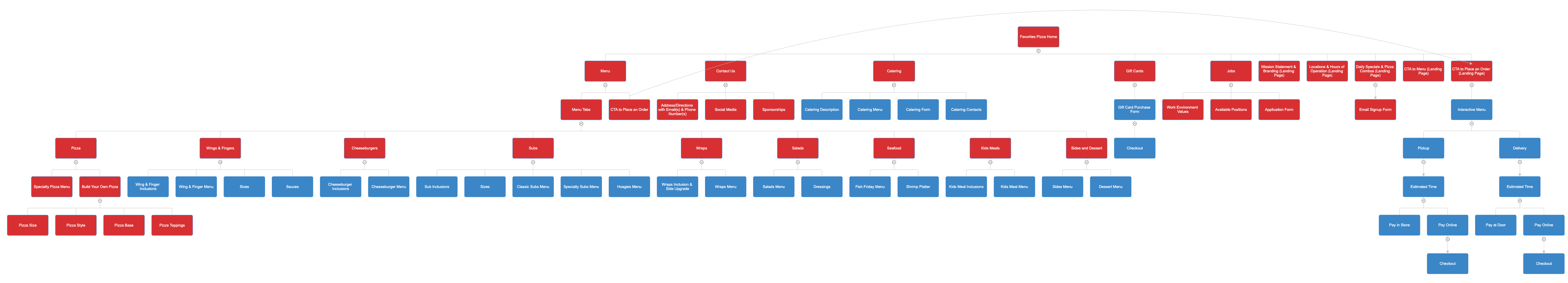
Next, I created a sitemap of the original website to show how chaotic and repetitive the information structure was. From there, I developed a redesigned sitemap that simplified the user flow, especially around the menu, contact information, specials, and job application sections.
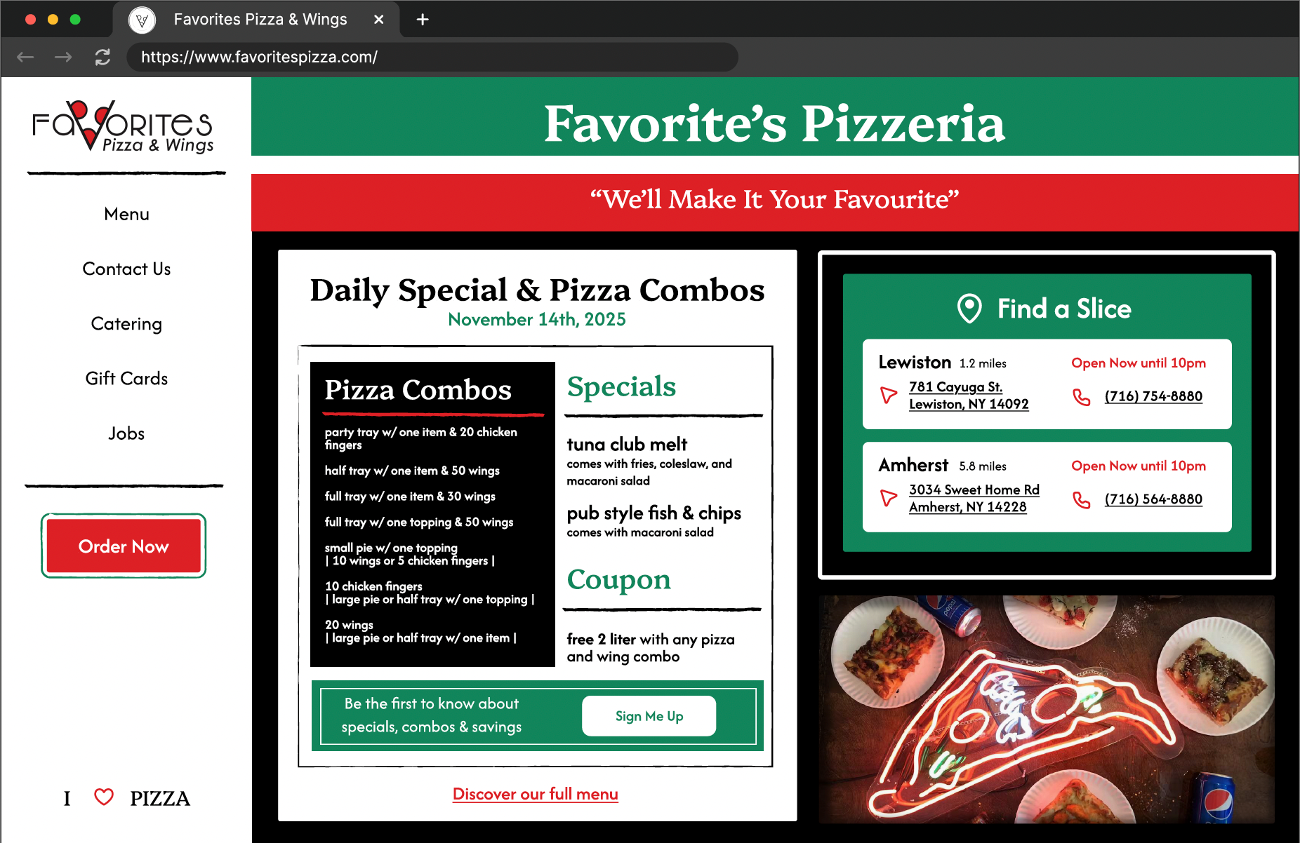
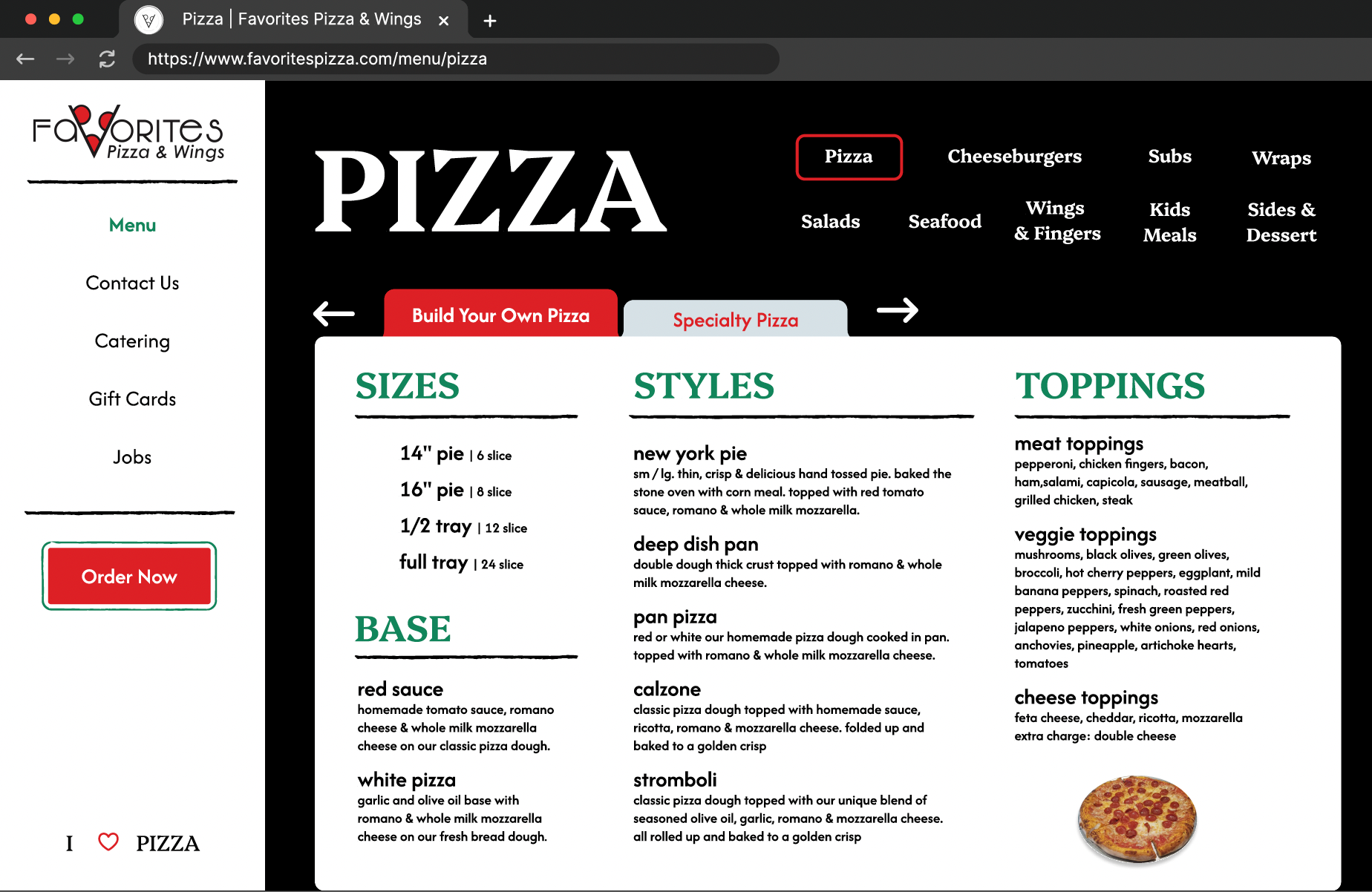
The redesign directly addressed the problems identified in my analysis by prioritizing readability, usability, visual identity, and brand professionalism. To improve readability, I created a clearer typography hierarchy using intentional font sizes, weights, and spacing to guide the user through the content. This was especially important on the menu page, where sections such as “Build Your Own Pizza” needed to be clearly separated and easy to scan. I also used borders and content boxes to organize information into digestible sections.
Brand identity was strengthened through a cohesive colour palette inspired by the restaurant’s logo, physical storefront, and packaging. The use of red, green, black, and white helped communicate an Italian-inspired visual identity while making the website feel more connected to the existing brand. I removed low-quality images from the original site and selectively replaced them with stronger visuals to create a more appetizing and professional presentation. Images were used intentionally rather than excessively, allowing the content to remain the focus.
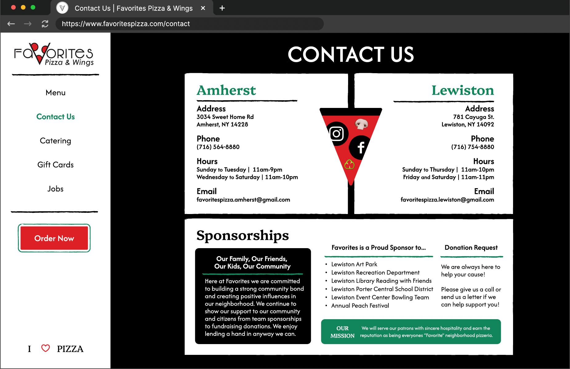
Navigation was another major area of improvement. The original website repeated the same contact information across multiple pages, which created confusion and clutter. In the redesign, I condensed contact details into a dedicated contact page while keeping essential information visible on the homepage. I also moved menu navigation from the side navigation bar to a more intuitive placement at the top of the menu page, reducing clutter and making the browsing experience easier.
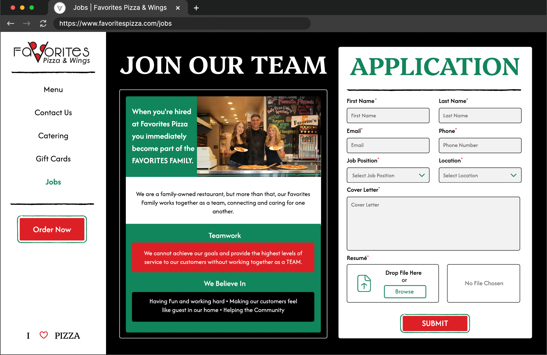
Additional design improvements included a stronger call-to-action for online orders, playful pizza-slice social media buttons, clearer browser tab labeling, and a more polished page structure. I also redesigned forms to be simpler and easier to understand, reducing unnecessary instruction text and adding clearer required fields such as job position and preferred location. The menu experience was improved with multiple navigation methods, including direct tab switching and arrow-based browsing.
Overall, the redesign elevated the website’s professionalism, improved usability, and created a stronger connection between the digital experience and the restaurant’s existing brand identity.
What I Learned
This project taught me how to analyze a website from the user’s perspective and identify where design, structure, and content were creating friction. I also learned how to work with an existing brand identity and extend it into a digital space in a way that feels cohesive and intentional. Most importantly, this project strengthened my understanding of information architecture and showed me how simplifying content flows can make a website more accessible, engaging, and effective.