Citradon — Brand & Product Redesign · 2026
Context
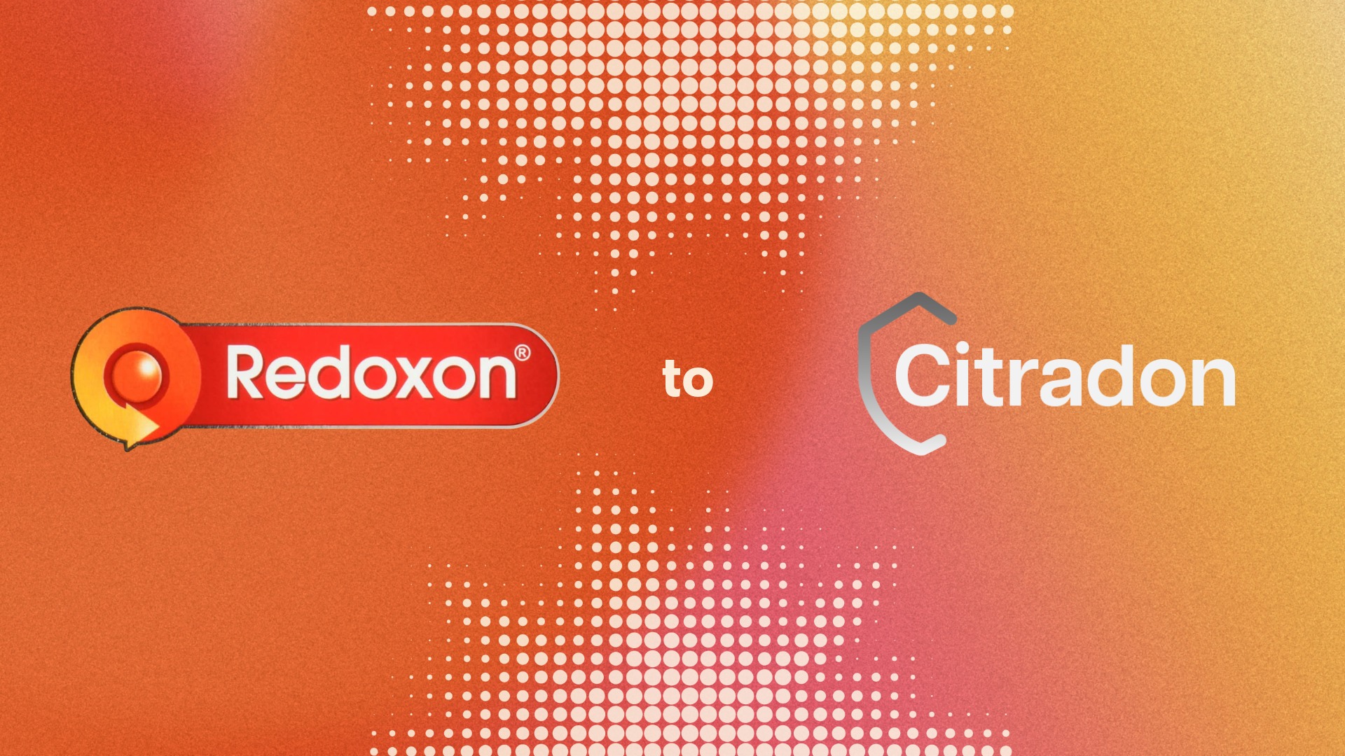
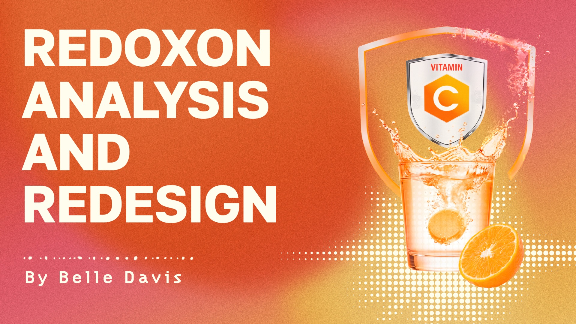
Created for a 2026 studio design class, this two-month project focused on researching, redesigning, and marketing an existing brand using a workflow that incorporated AI. I chose to redesign Redoxon, a Vitamin C effervescent supplement, and rebranded it as Citradon.
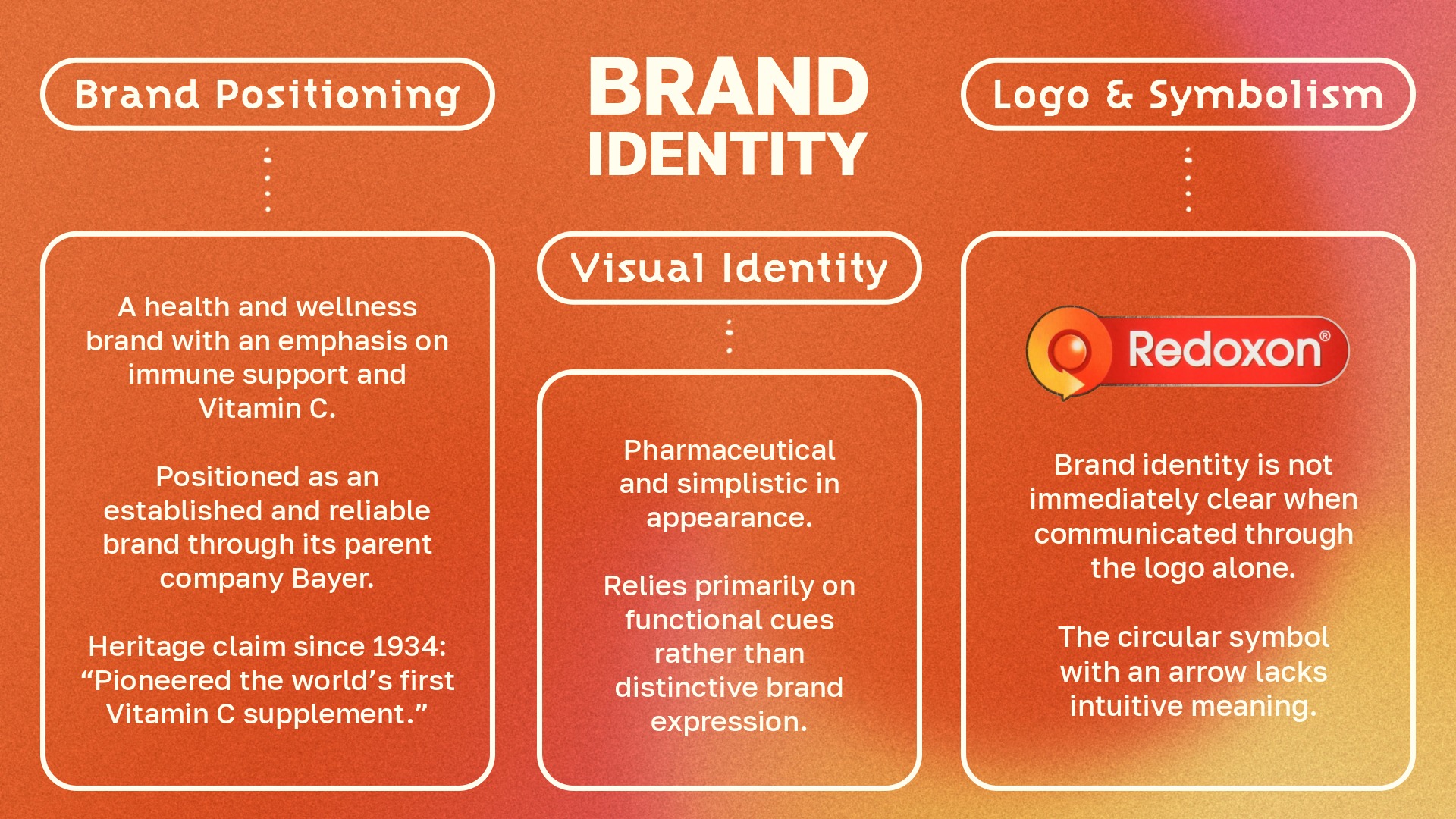
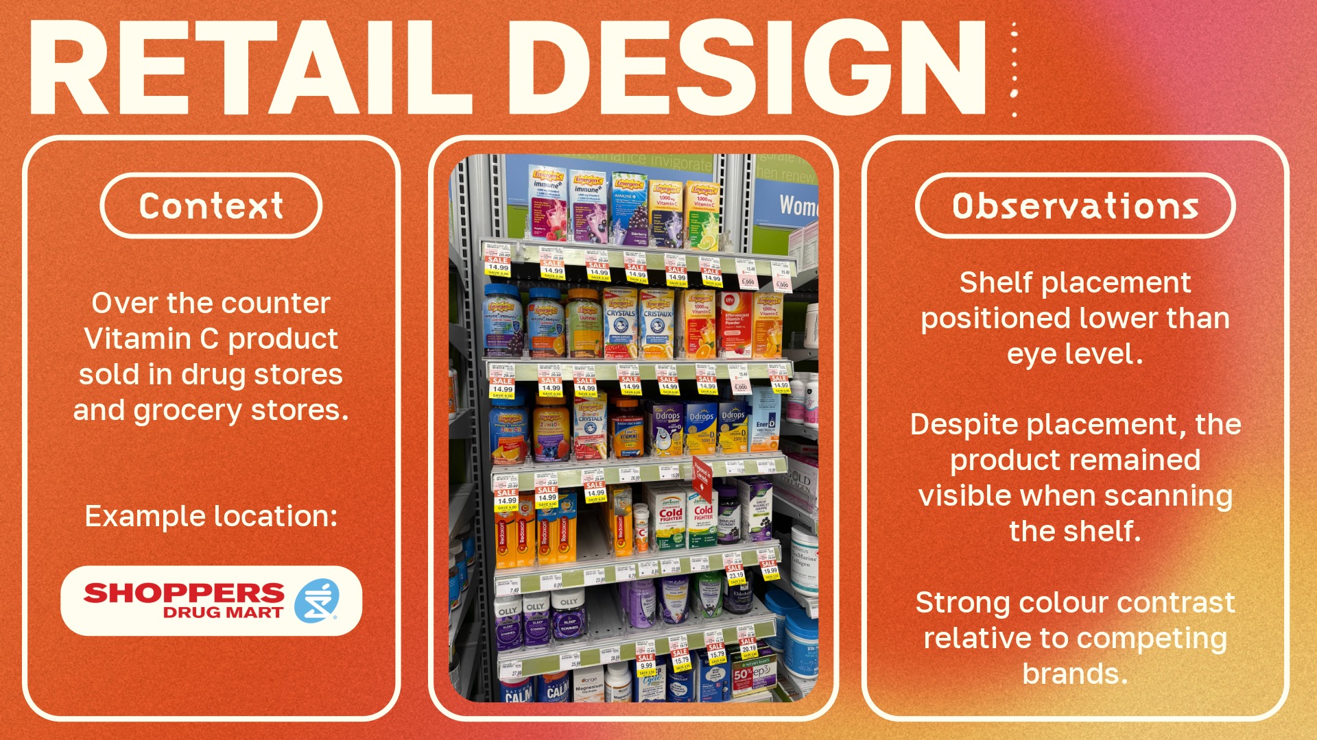
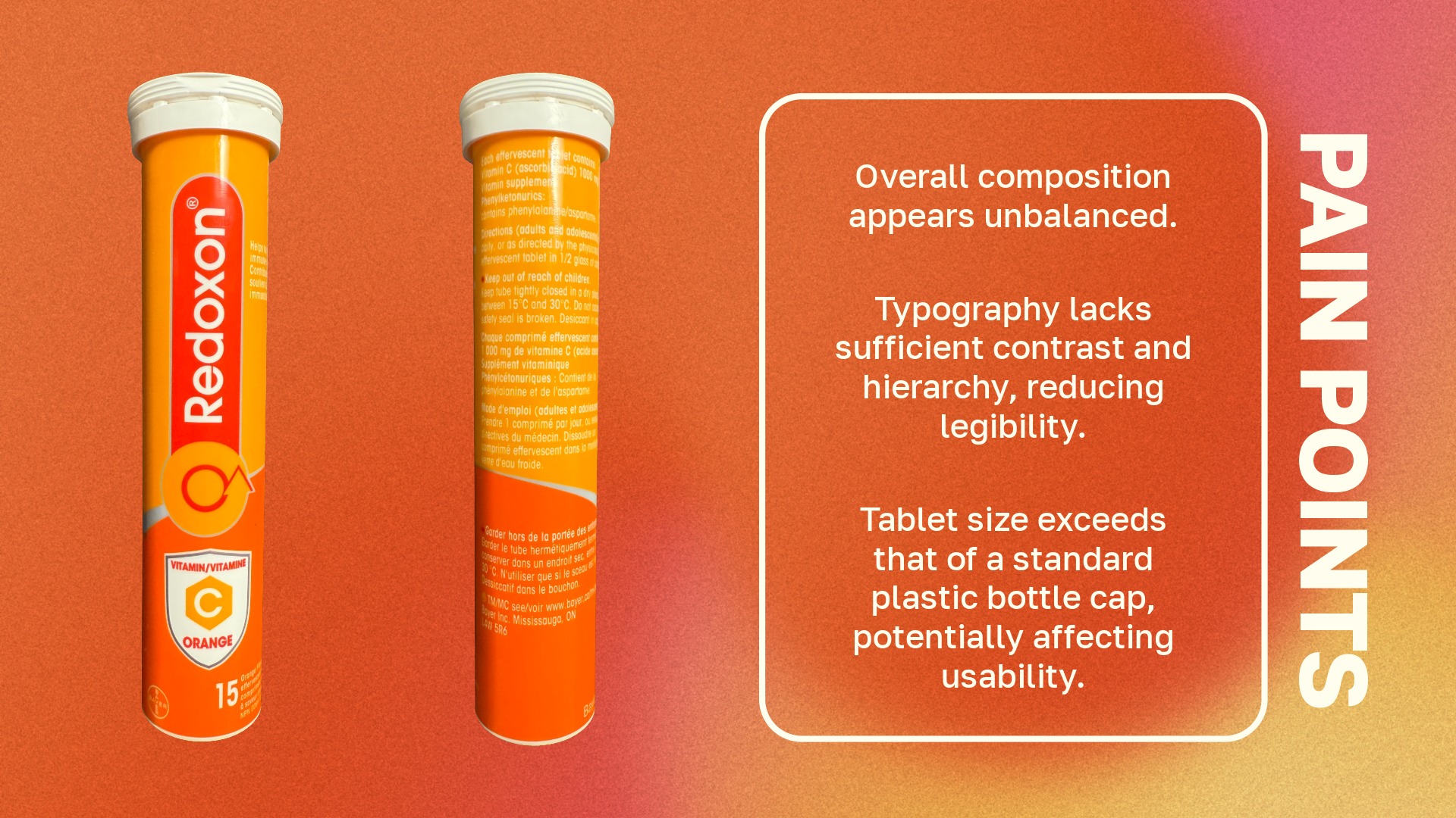
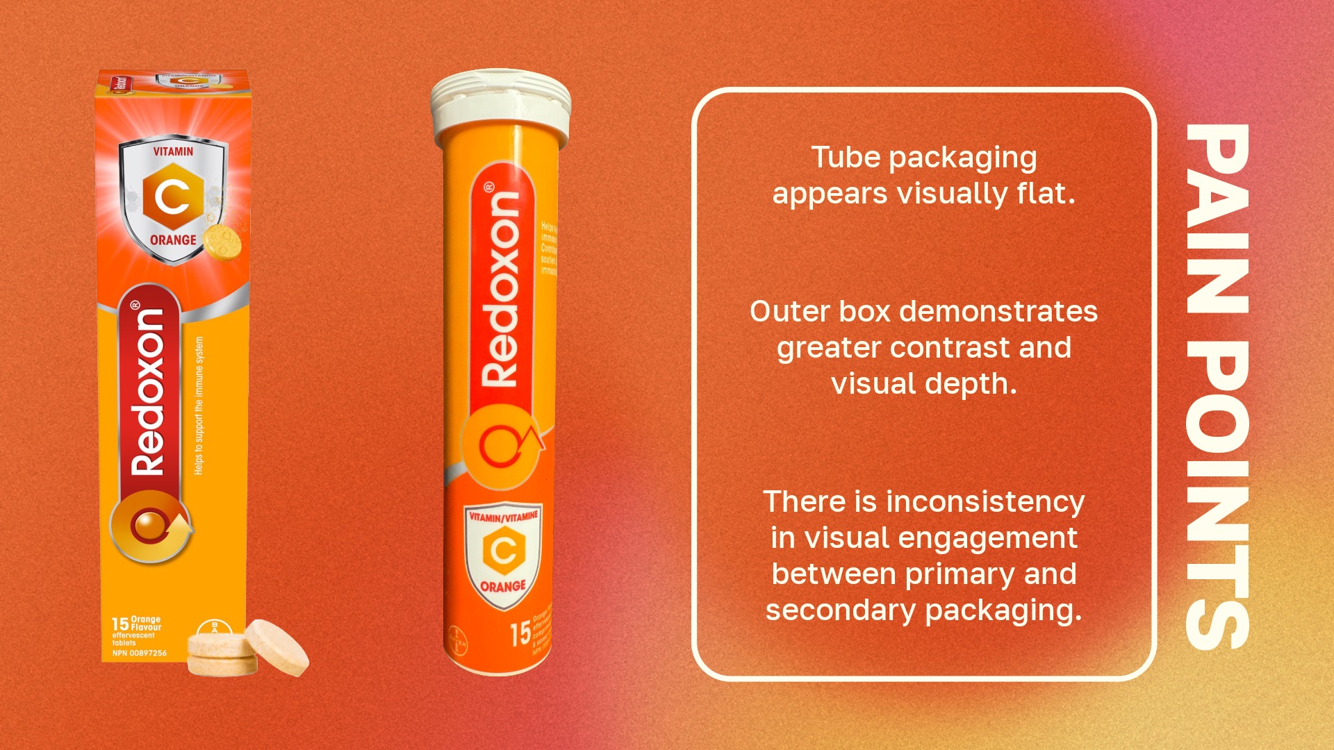
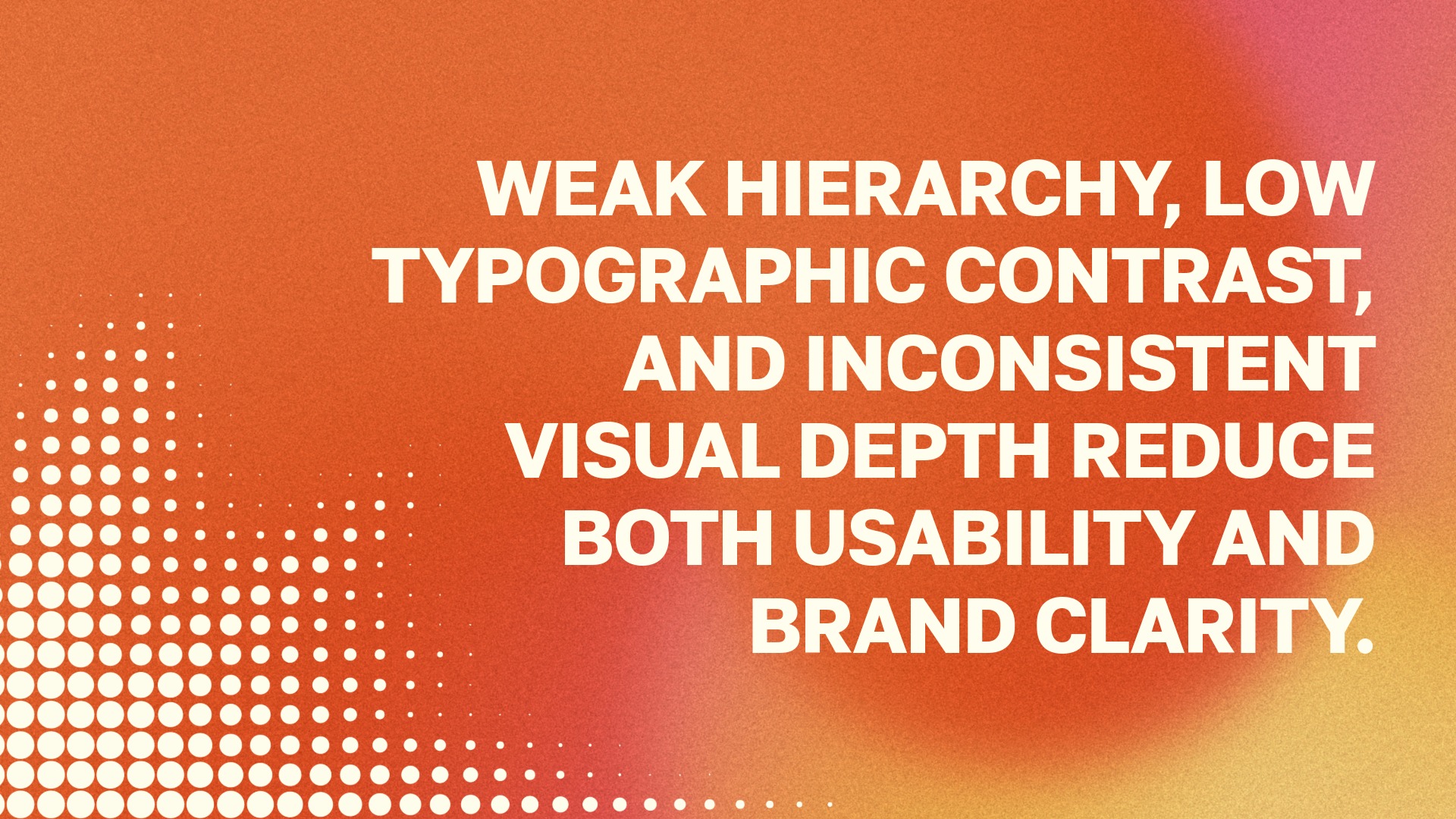
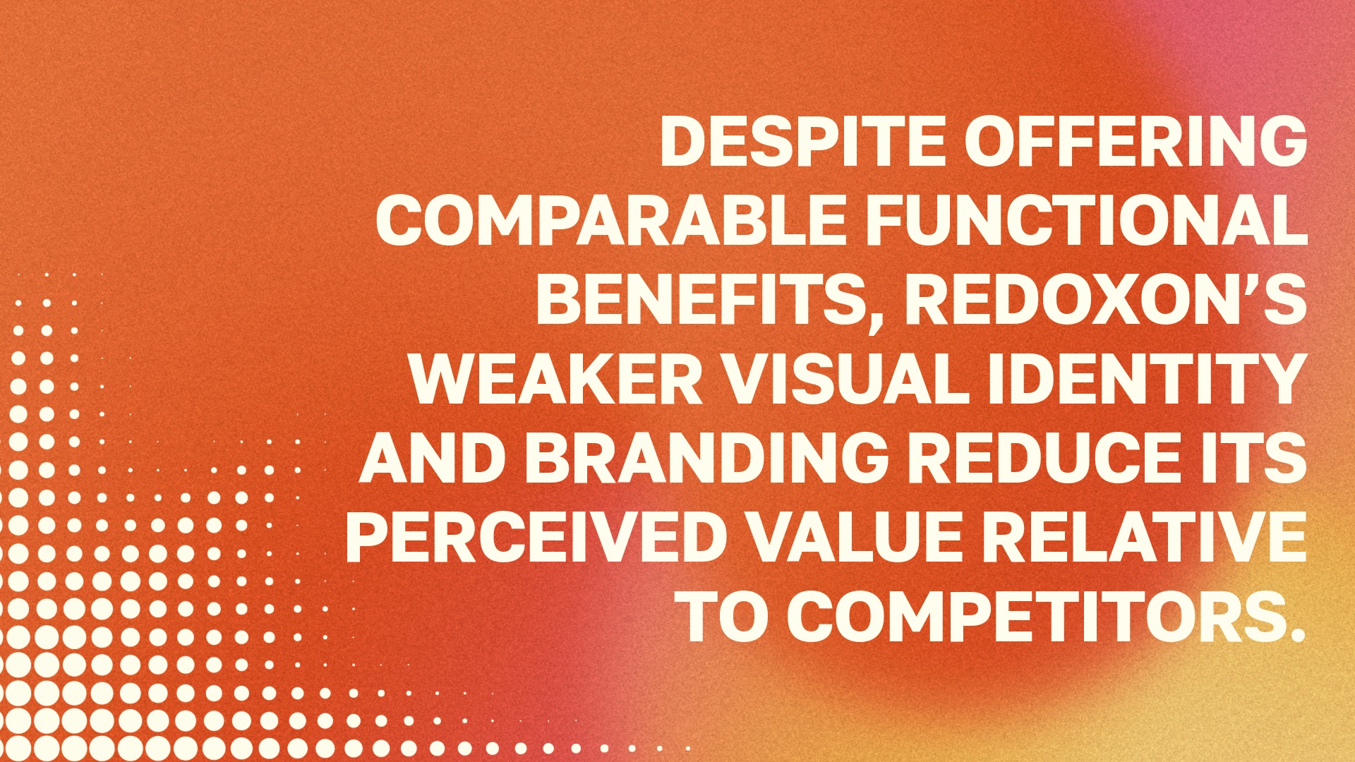
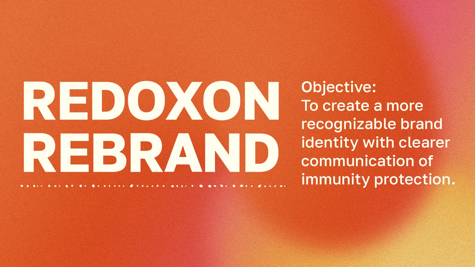
Through my research, I found that Redoxon had strong functional benefits but lacked a clear and memorable visual identity. Its shelf presence relied heavily on colour rather than brand differentiation, and its packaging had issues with hierarchy, readability, and visual depth. My goal was to create a more recognizable brand identity that communicated immunity protection more clearly while making the product feel more modern, approachable, and lifestyle-oriented.
Role
This was an individual project where my roles were UX Researcher, Product Designer and Graphic Designer.
Tools
Adobe Creative Suite: Illustrator, Firefly, Express, Photoshop
Creative Approach
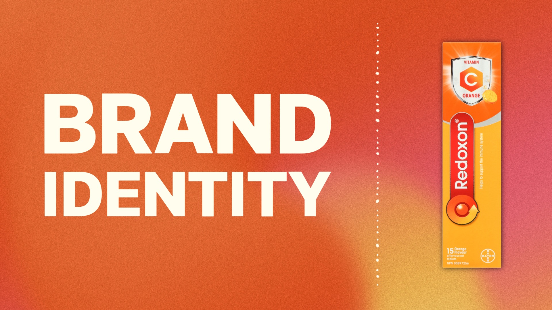
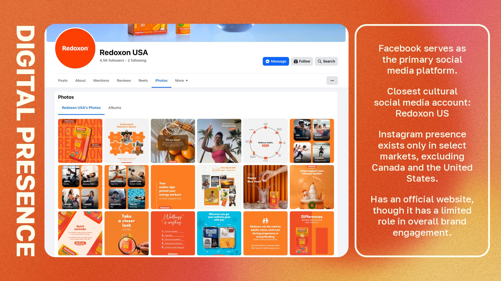
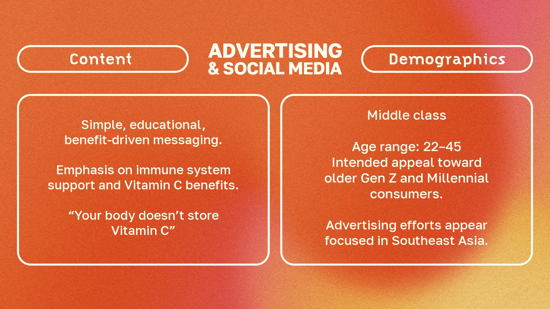
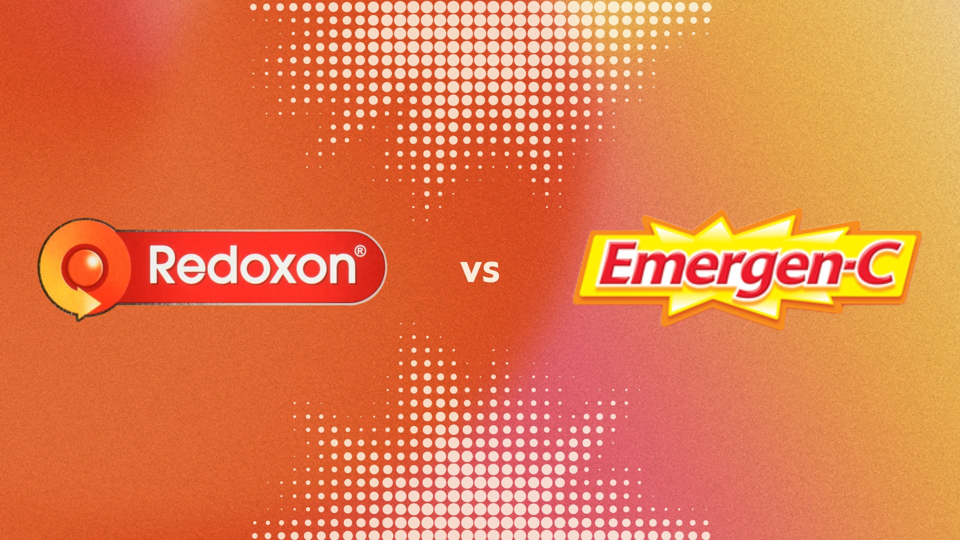
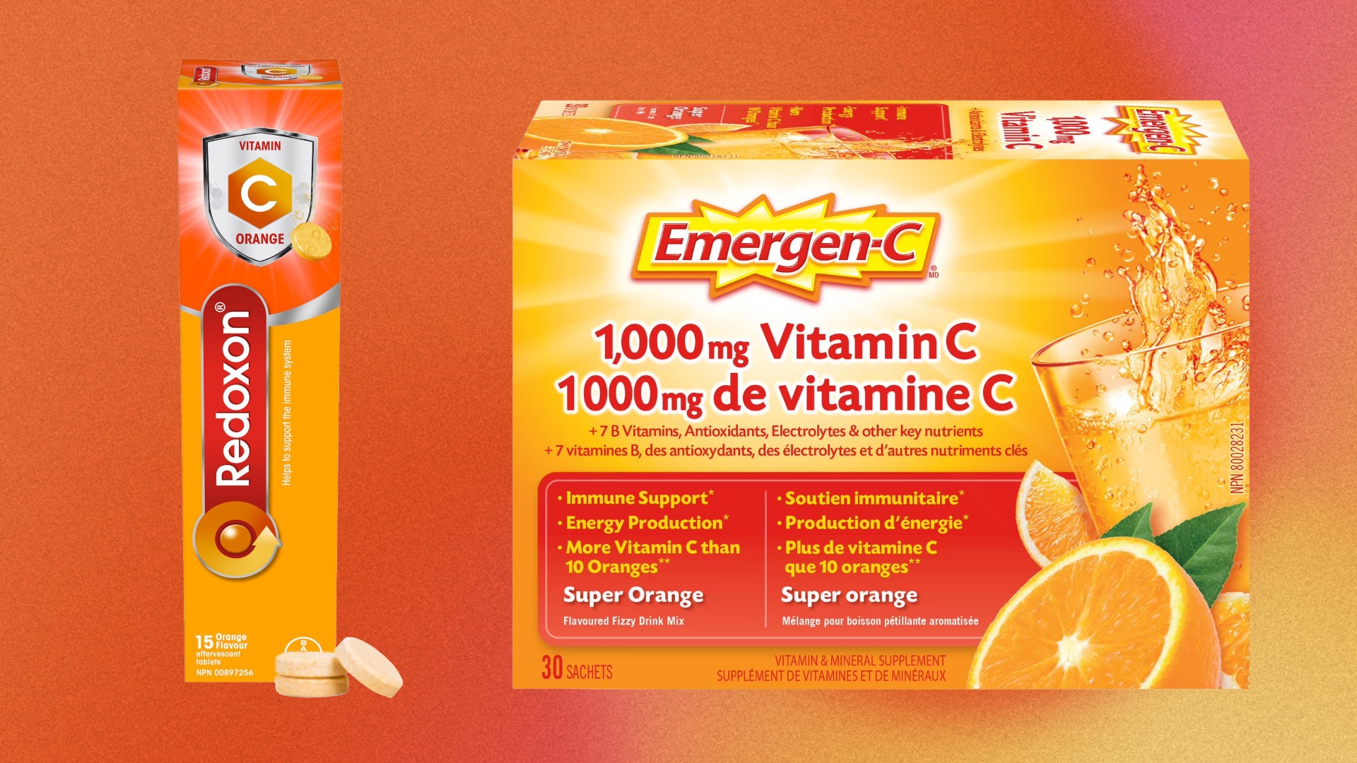
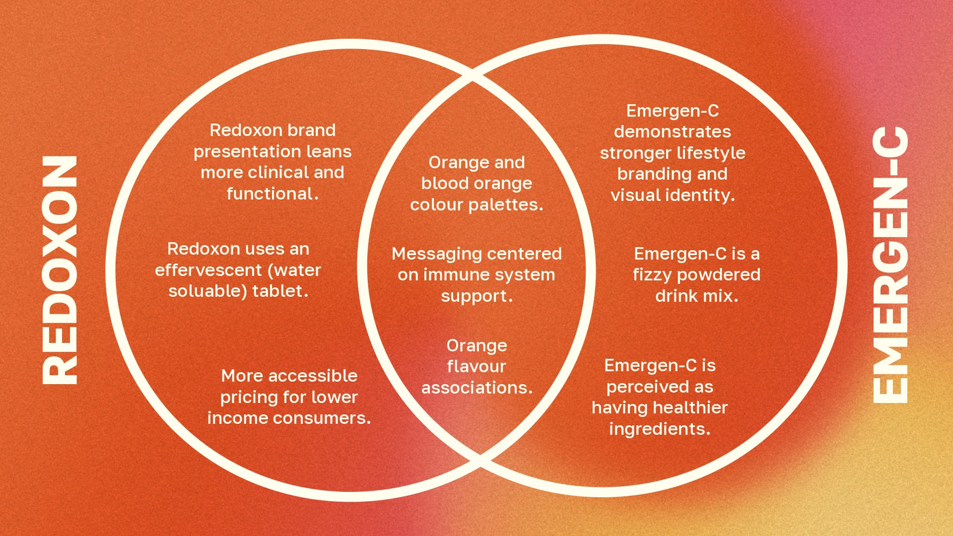
I began by analyzing Redoxon’s existing brand identity, packaging, retail presence, and digital marketing. The original brand positioned itself as a reliable health and wellness product, but its logo and visual system did not communicate the brand clearly on their own. I also compared Redoxon to competitors such as Emergen-C, which had stronger lifestyle branding and a more distinctive visual identity.
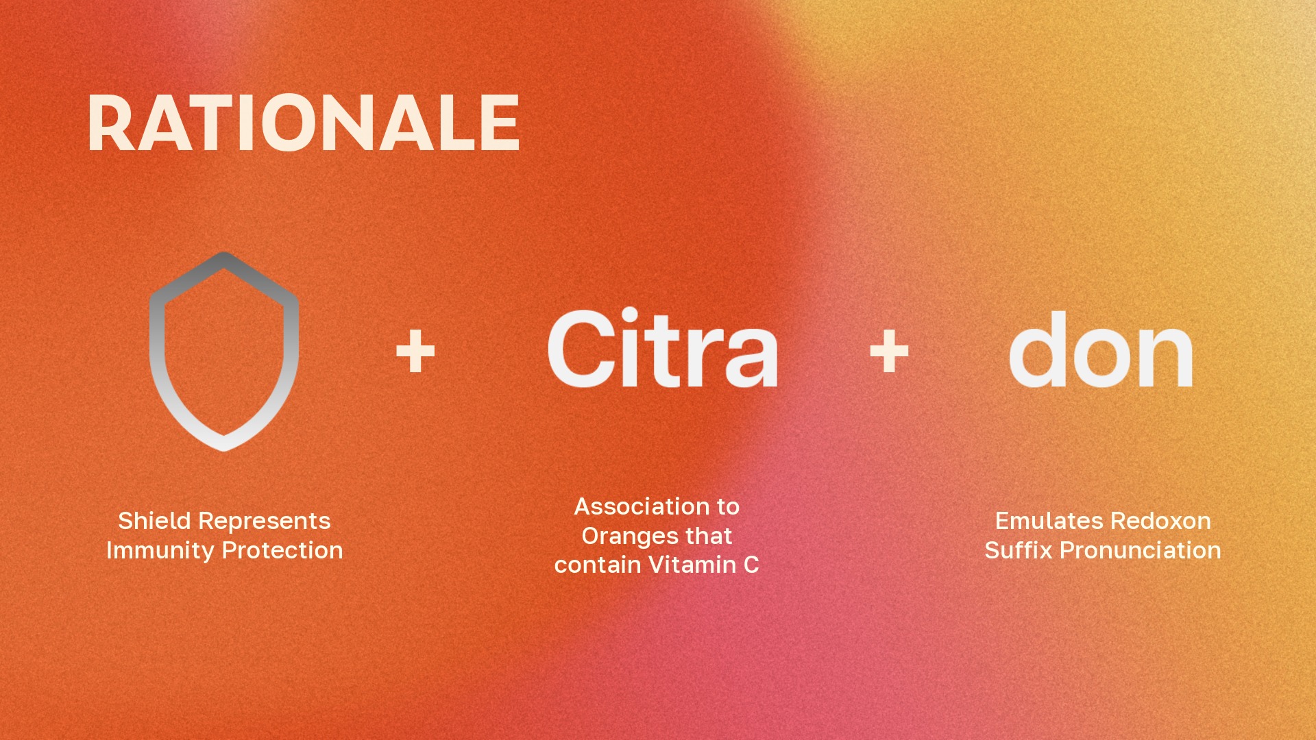
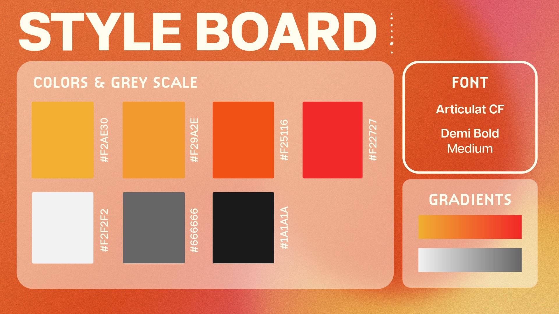
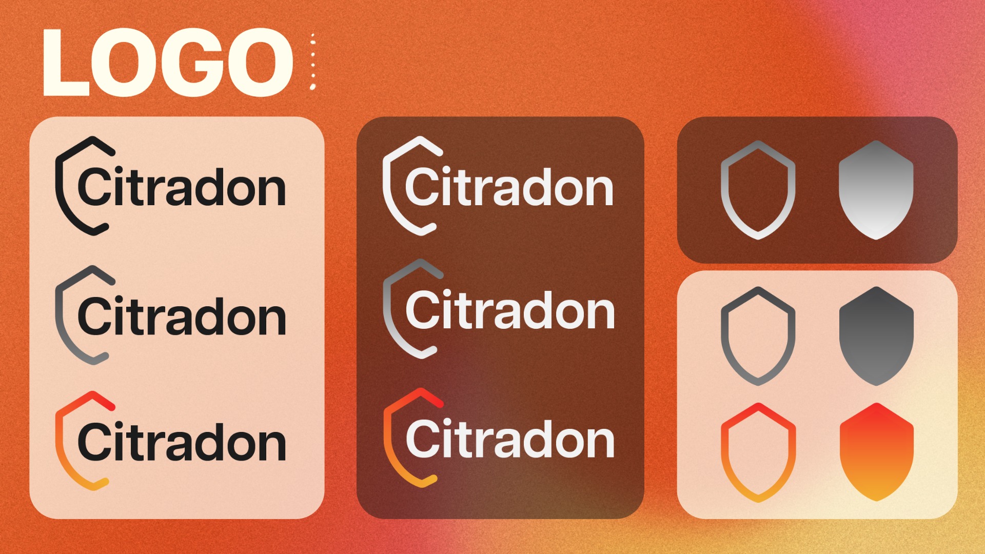
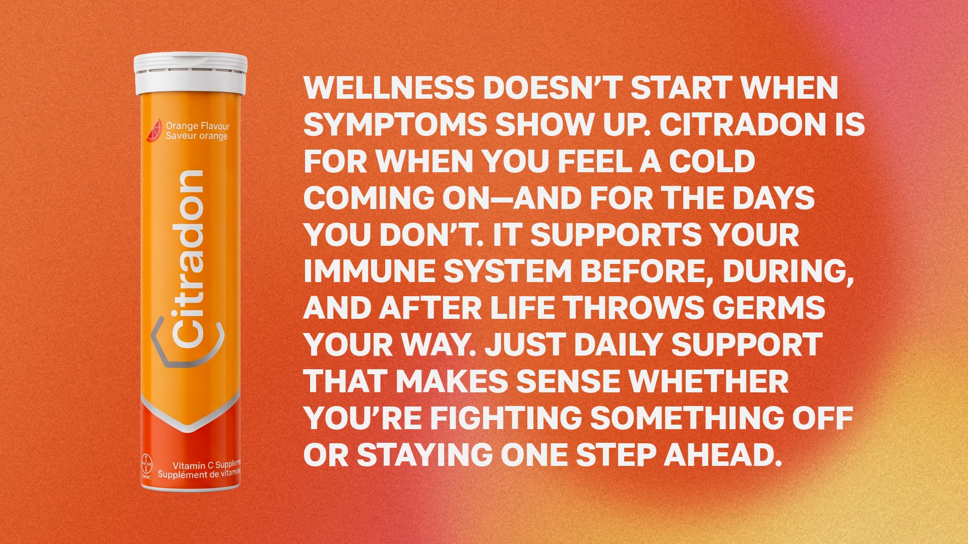
From this research, I developed the rebrand from Redoxon to Citradon. The new name combines “citra,” referencing citrus and Vitamin C, with “don,” echoing the sound of the original brand name. I also redesigned the logo to include a shield form, symbolizing immunity protection, while keeping the orange and red colour palette to maintain the product’s connection to citrus and Vitamin C.
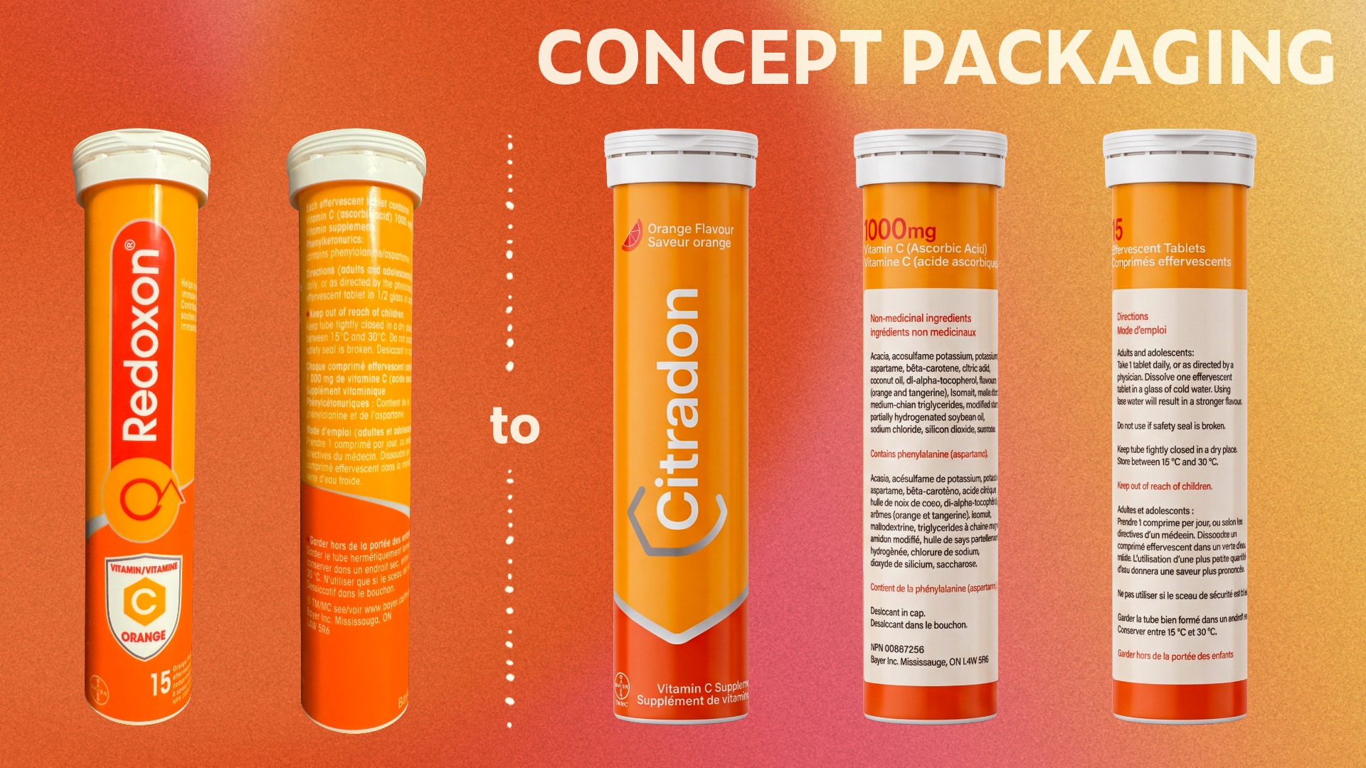
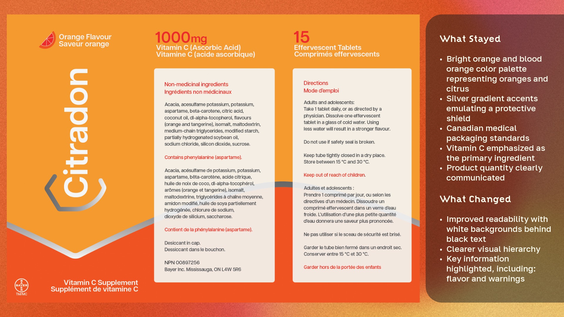
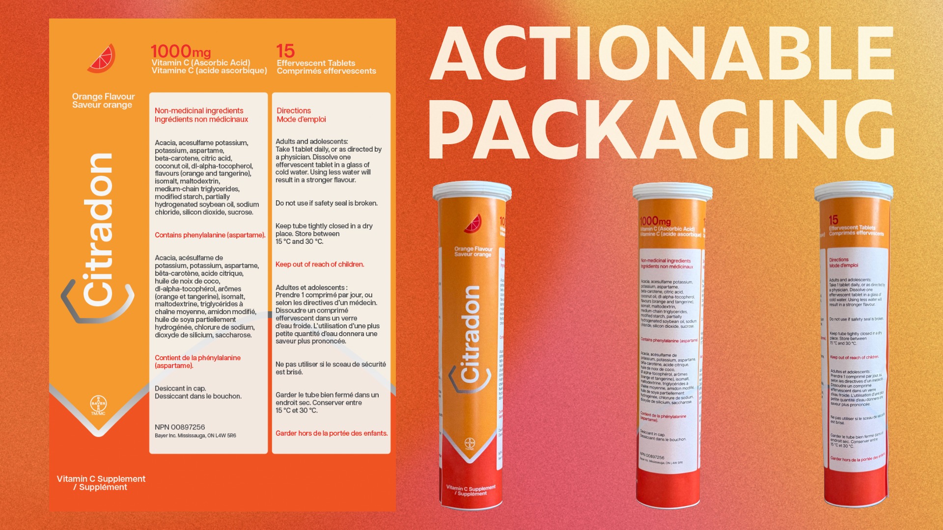
For the packaging redesign, I focused on improving readability, hierarchy, and usability. I kept key recognizable elements, such as the bright citrus colour palette, silver shield-inspired accents, Canadian medical packaging standards, and clear Vitamin C messaging. However, I improved the layout by adding white backgrounds behind important text, clarifying the hierarchy, and highlighting key information such as flavour, warnings, ingredients, and product quantity.
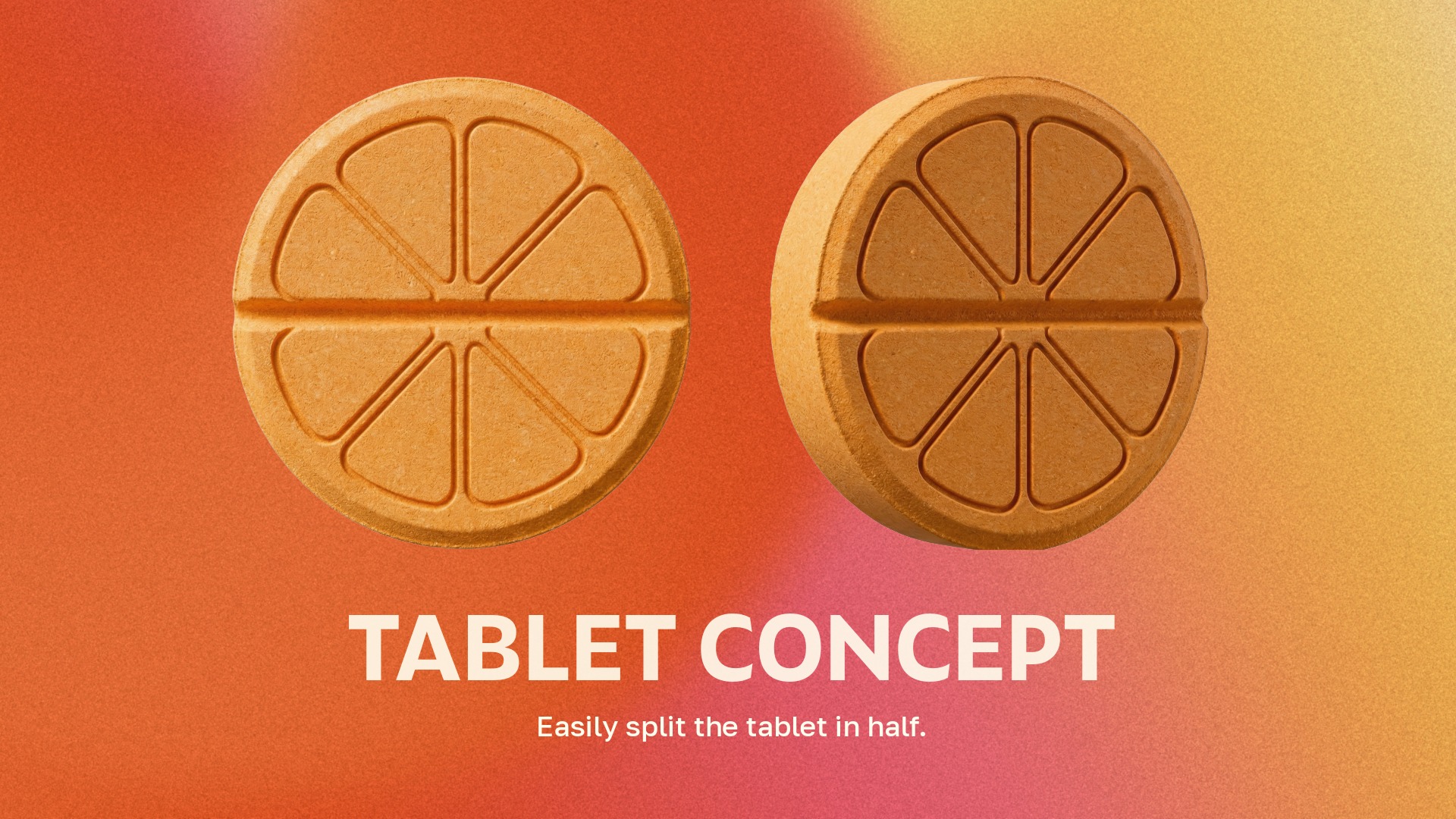
I also developed a tablet concept inspired by orange slices, designed to make the product feel more recognizable and user-friendly. The tablet could be split in half, addressing a usability issue I identified in the original product, where the tablet size felt too large.
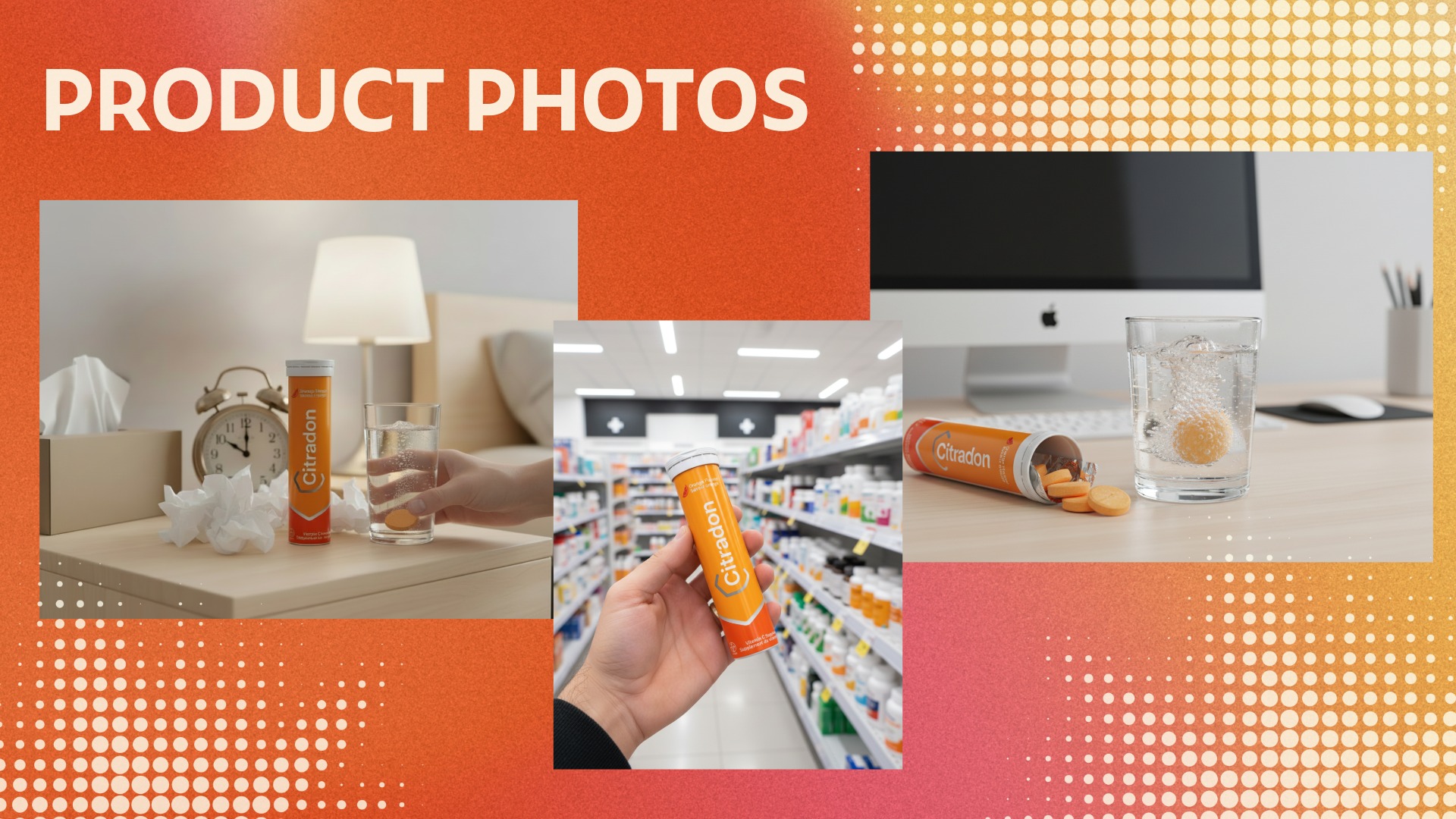
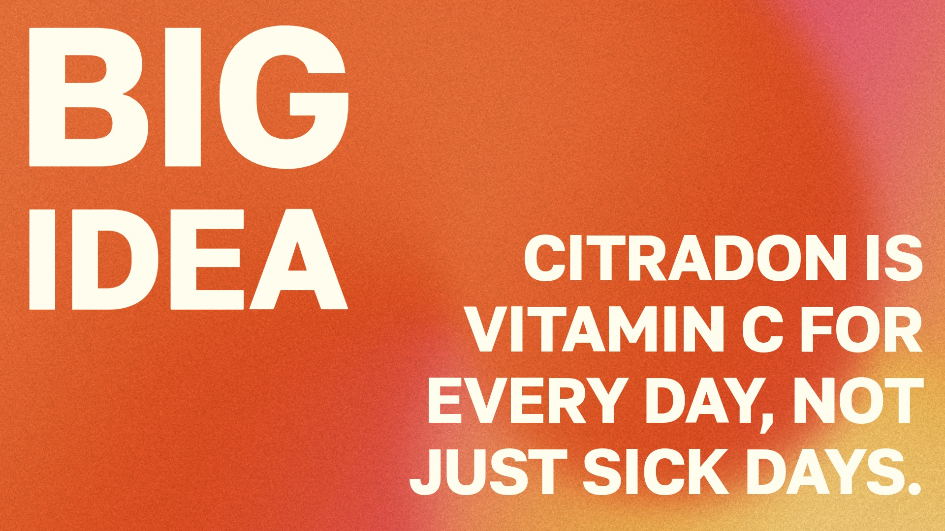
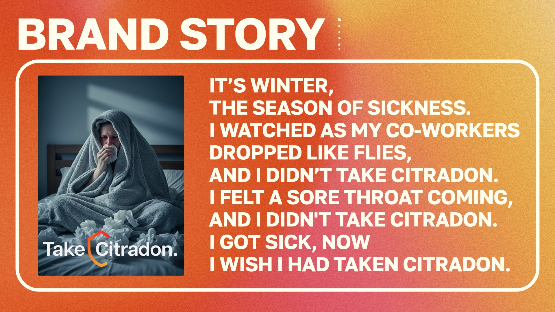
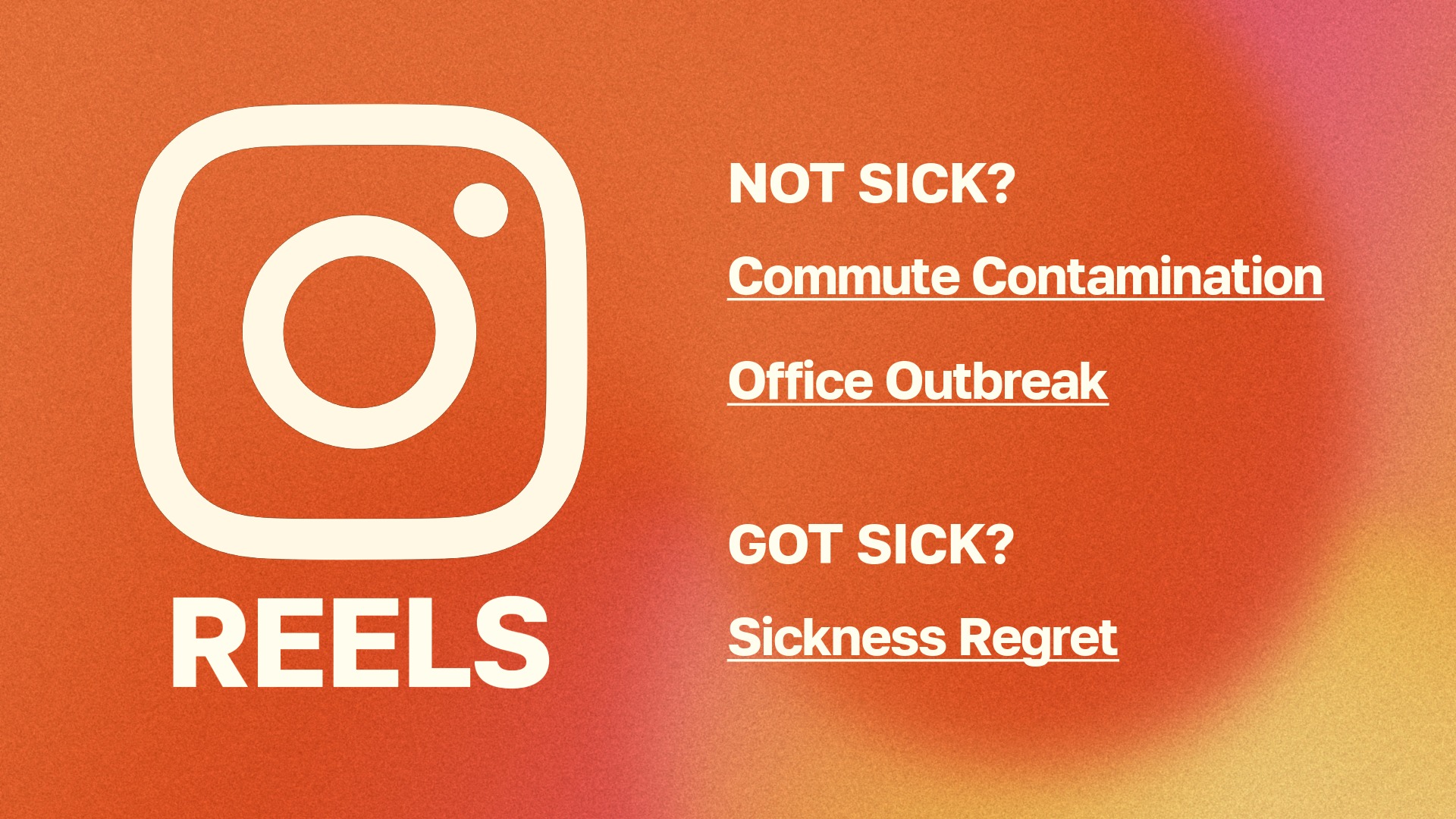
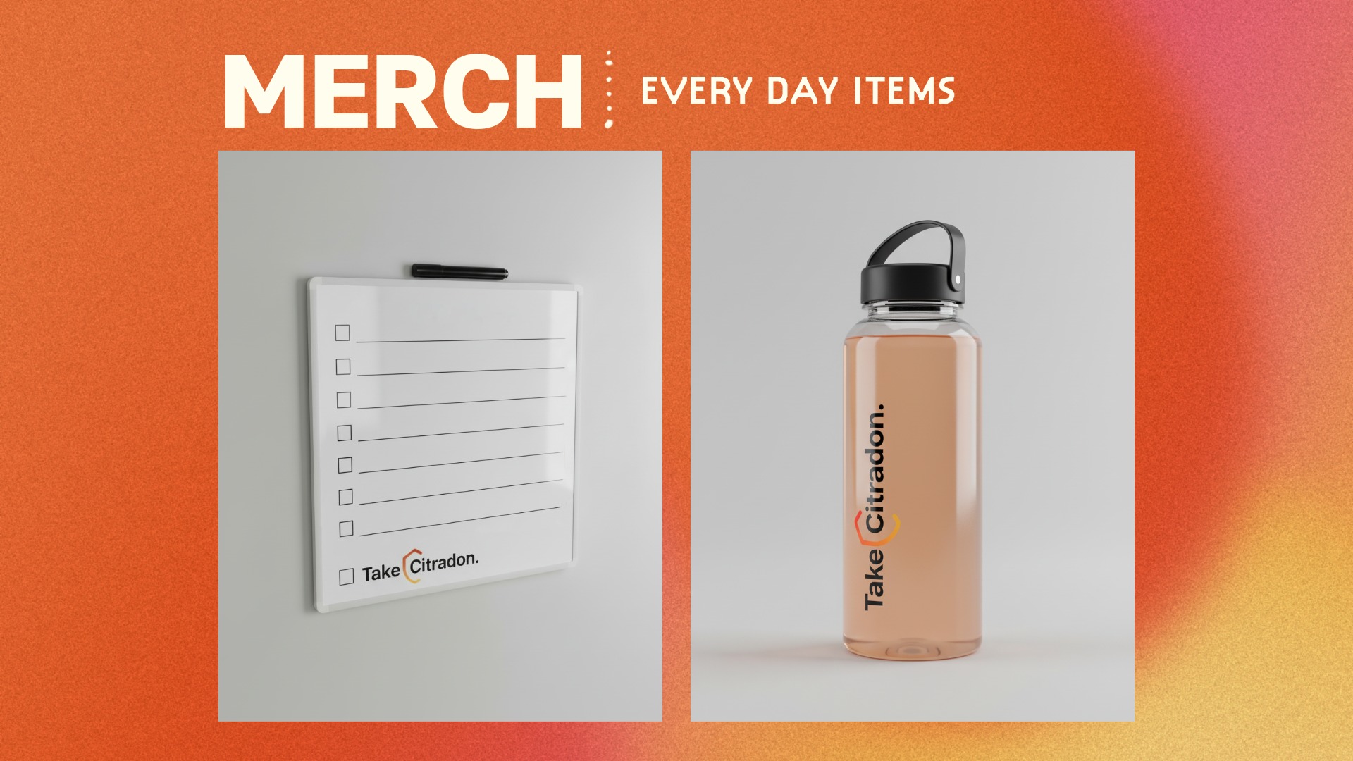
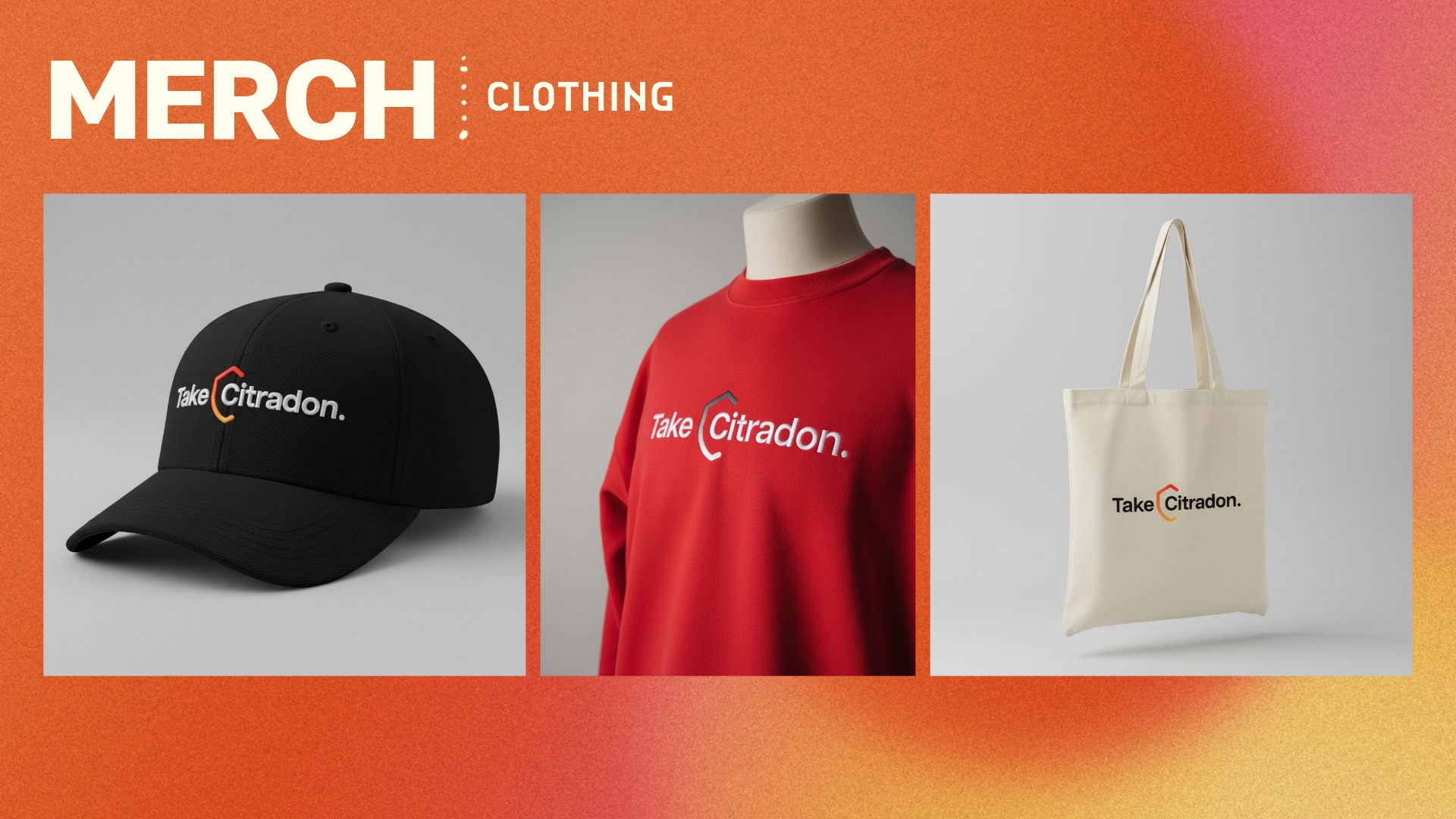
To extend the rebrand beyond packaging, I created a broader campaign strategy around the big idea: “Citradon is Vitamin C for every day, not just sick days.” This positioned the product as daily immune support rather than something used only when symptoms appear. I supported this concept through AI-generated product photography, social media campaign concepts, Instagram reel ideas, and branded merchandise, including everyday items and clothing.
What I Learned
This project taught me how to use AI image generation as part of a design workflow rather than as a replacement for design thinking. I learned how to direct AI-generated visuals through clearer prompts, then refine and apply those outputs within a cohesive brand system. It also strengthened my ability to analyze an existing product, identify weaknesses in its visual identity and user experience, and translate those insights into a full rebrand across logo design, packaging, marketing, and campaign strategy.
Most importantly, I learned how to balance familiarity with innovation. The redesign needed to stay recognizable enough to connect back to the original product category, while still giving Citradon a stronger identity, clearer communication, and a more engaging presence for modern consumers.